Suggestions for Foundation Framer -...

User 122279 Photo


Senior Advisor
14,535 posts

I soooo wish that the 'Show Guides' could be moved into the Settings, and made to stay permanently until you 'unset' them. This goes for RSD too.
Coming from coding and am used to making borders or weird background colours to separate one 'box' from the next, I need to 'see' where I am in a document, and it is a real hassle having to select the guides again and again, every time I open the programme.
Ha en riktig god dag!
Inger, Norway

My work in progress:
Components for Site Designer and the HTML Editor: https://mock-up.coffeecup.com


User 122279 Photo


Senior Advisor
14,535 posts

UncleMap wrote:
Stick with what you know


A wise word, especially with that signature of yours! :D:D
Ha en riktig god dag!
Inger, Norway

My work in progress:
Components for Site Designer and the HTML Editor: https://mock-up.coffeecup.com


User 372018 Photo


Registered User
2 posts

I would like to see the ability to customize the naming conventions of the underlying export file structure...

So like in RSD where you export and end up with "coffeegrinder.css" and js files or with "Foundation.css" and js files.

I would like to control these names in export.
I was born for this moment!
User 2088758 Photo


Senior Advisor
3,105 posts

BurrMan wrote:
I would like to see the ability to customize the naming conventions of the underlying export file structure...

So like in RSD where you export and end up with "coffeegrinder.css" and js files or with "Foundation.css" and js files.

I would like to control these names in export.


Just wondering why you would want to do this?
Taking over the world one website at a time!

Steve Kolish
www.misterwebguy.com

YouTube Channel:
https://www.youtube.com/channel/UCL8qVv … ttneYaMSJA
User 434929 Photo


Ambassador
938 posts

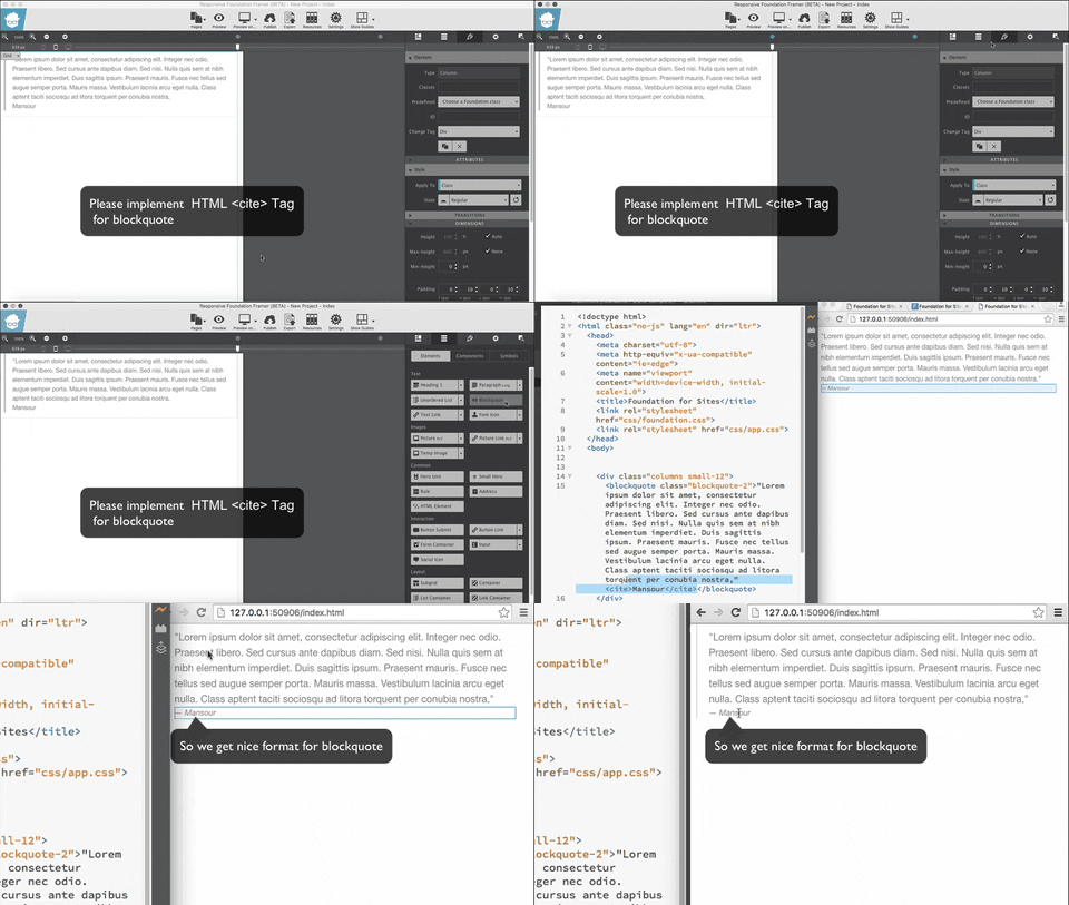
Feature Request :

Giving Name To The Containers /Elements

https://www.youtube.com/watch?v=Dk7molv03y8

Guys at coffeecup are awesometacular.
User 379556 Photo


Registered User
1,558 posts

Regarding Mansour's video, I too would like to see naming of items in the Inspector.

Regarding the very last part of the video, I find that I can get the effect of dragging horizontally in the Inspector. If items 1 and 2 are at the same level, I make item 2 a child of item 1 by dragging item 2 onto the middle (i.e. onto the bar) of item 1.

Frank
User 434929 Photo


Ambassador
938 posts

https://media.giphy.com/media/3o6Zt9CsUCQM6gJ9cs/giphy.gif
Guys at coffeecup are awesometacular.
User 2440486 Photo


Registered User
11 posts

For guides add "show all" and make the default color black. Thin blue is very hard to see.
Allow setting more defaults. I HATE thin blue and thoroughly dislike having to change all inserted text.
Please review your pages for user visibility on an older monitor. I do not care to be forced to purchase new computers and monitors every three years because some programmer thinks that thin lines and weak colors are Cool. Note that Amazon always uses strong text and no nonsense colors. They want users to Be Happy.
My 84 year old eyes and $150 monitor means that all but the strongest graphics cannot be seen. The very very weak color for selected text is only imaginary for the most part. No, High Contrast does not help, it does not work here for me.
Some times I wish I still used CoolPage.
User 2699991 Photo


Registered User
5,057 posts
Online Now

How about fixing the leaping elements ?

Sometimes if you click on an element it disappears without trace, or leaps out of it's container/column etc into another one. Especially if trying to edit text, but it has happened with image placeholders and other stuff.

How about a drop down menu choice foe items like in RSD such that in design view when you hover top left corner of something it shows all the stuff associated with that thing (row, column, container element etc) so that you can choose what you need to become active to make your changes, it's getting to be a bit of a pain in the bum to keep having to go to the inspector pane to get to what I need to style or change. for everything.especially on large pages with lots and lots of different elemnets.

Otherwise Great app so far which is getting better and better everyday as I get my head around how it can work for me.
Mastering The Understanding With Hands-On Learning
NEW TO "COFFEECUP SITE DESIGNER" FOUNDATION 6 FRAMEWORK?
STUCK ON SOMETHING?

LEARNING & UNDERSTANDING "THE HOW TO"? THE WHY'S & THE WHEREFORE'S?
WITH WAYAN'S STEP BY STEP TUTORIALS
Contact Me For One To One Assistance
https://mawarputih.coffeecup.com/forms/contact-wayan/

A simple quick way to contact me
https://rsd-tutorialscom.coffeecup.com/ … l-details/

User 103173 Photo


VP of Software Development
0 posts

Wayanjaya wrote:

How about a drop down menu choice foe items like in RSD such that in design view when you hover top left corner of something it shows all the stuff associated with that thing (row, column, container element etc) so that you can choose what you need to become active to make your changes, it's getting to be a bit of a pain in the bum to keep having to go to the inspector pane to get to what I need to style or change. for everything.especially on large pages with lots and lots of different elemnets.

Foundation Framer has always had this, unless I don't understand that you are describing. ;)

https://s31.postimg.org/vo2f2cyaz/Screen_Shot_2016_07_16_at_4_50_39_PM.png

If your ZOOM is not set to 100%, you do have to use the Inspector pane.
Learn the essentials with these quick tips for Responsive Site Designer, Responsive Email Designer, Foundation Framer, and the new Bootstrap Builder. You'll be making awesome, code-free responsive websites and newsletters like a boss.

Have something to add? We’d love to hear it!
You must have an account to participate. Please Sign In Here, then join the conversation.