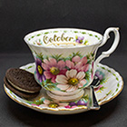
So what exactly does "In der beschraenkung zeigt sich der Meister" mean? It's kind of hard to comment on something when we all aren't multi language individuals.
A Rose is Just a Weed in a Corn Patch!
It's just a German way to say 'less is more', or to be more exact: 'The Master is identified by his restriction'. It's a quotation from from one of the works by the German poet Johann Wolfgang von Goethe.
Ha en riktig god dag!
Inger, Norway
My work in progress:
Components for Site Designer and the HTML Editor: https://mock-up.coffeecup.com
Inger, Norway
My work in progress:
Components for Site Designer and the HTML Editor: https://mock-up.coffeecup.com
So what exactly does "In der beschraenkung zeigt sich der Meister" mean? It's kind of hard to comment on something when we all aren't multi language individuals.
Sorry, I am just a victim of an old Dutch secondary school system where we all had to learn during 5 years at least 3 foreign languages (plus study classic literature and poetry
Inger had similar duties in Norway, I presume (or knows how to use Google translate and Wikipedia).
Eindhoven :: Netherlands
It's easy to see, once you see it.
It's easy to see, once you see it.
That's right, I also had to study 3 foreign languages (plus classic literature). My third one was French, which I haven't used too much through the years, so it's got a bit 'stale' now. 
Ha en riktig god dag!
Inger, Norway
My work in progress:
Components for Site Designer and the HTML Editor: https://mock-up.coffeecup.com
Inger, Norway
My work in progress:
Components for Site Designer and the HTML Editor: https://mock-up.coffeecup.com
Thank you both for the clarification. Great quote.
A Rose is Just a Weed in a Corn Patch!
http://nirman.com/blog/2017/04/26/mies- … detailing/
puncto – grafik & marketing
D - 69126 Heidelberg
https://www.puncto.info
Actually you´ll find my work here: https://puncto.coffeecup.com/
D - 69126 Heidelberg
https://www.puncto.info
Actually you´ll find my work here: https://puncto.coffeecup.com/
sometimes less is exactly what is says and means "LESS"
in any language
in any language
Mastering The Understanding With Hands-On Learning
NEW TO "COFFEECUP SITE DESIGNER" FOUNDATION 6 FRAMEWORK?
STUCK ON SOMETHING?
LEARNING & UNDERSTANDING "THE HOW TO"? THE WHY'S & THE WHEREFORE'S?
WITH WAYAN'S STEP BY STEP TUTORIALS
A simple quick way to contact me
https://rsd-tutorialscom.coffeecup.com/ … l-details/
NEW TO "COFFEECUP SITE DESIGNER" FOUNDATION 6 FRAMEWORK?
STUCK ON SOMETHING?
LEARNING & UNDERSTANDING "THE HOW TO"? THE WHY'S & THE WHEREFORE'S?
WITH WAYAN'S STEP BY STEP TUTORIALS
A simple quick way to contact me
https://rsd-tutorialscom.coffeecup.com/ … l-details/
I would like to see the edit list open in it's own window so it can be moved around to see the complete view on my laptop. See the attached view for more details. I don't know if there is anything important missing.
Learn something, Share something.
For SEO purposes, I often use long file names. When using the Page Manager, it is often hard to select a page because it only displays a portion of the file name. I know I can wait for the tooltip to come up, but t would be quicker if there were some way to see the longer file names. I’m not sure that’s possible given all that needs to be displayed in the Page Manager, but I thought I’d throw the suggestion in.
ASK ME ANYTHING
I provide personalized help for Coffeecup Users including personal or group training for Site Designer, Web Form Builder and more via Zoom.
Email me at support@uscni.org or call 865-687-7698.
Did you know that Web Form Builder can be used for both simple and complicated forms and that it's not limited to the default fonts and buttons? Take a look at a form we developed for WindowTinting.com.
https://forms.windowtinting.com/forms/w … ppingcart/
One thing I'd like is this: Most of the means of highlighting an item are "floating," that is, they disappear when the item is selected, leaving only faint grey lines that are difficult to see. Likewise the grey diagonals indicating empty space. A selected item should have a distinctive outline.
Another thing: Is there a way to control the placement of a new items? When I did the "Visions" tutorial I inadvertently skipped a step, then spent TWO HOURS of increasing frustration trying to place the container I'd missed, only to have the page get more and more messed up with every attempt. So, how does one place a new contaner or item IN-BETWEEN two existing ones?
Another thing: Is there a way to control the placement of a new items? When I did the "Visions" tutorial I inadvertently skipped a step, then spent TWO HOURS of increasing frustration trying to place the container I'd missed, only to have the page get more and more messed up with every attempt. So, how does one place a new contaner or item IN-BETWEEN two existing ones?
Have something to add? We’d love to hear it!
You must have an account to participate. Please Sign In Here, then join the conversation.


