CSS Controls: Applying Border and Border Radius
Borders can be used for many different things and come with several different options. The first thing you need to know about borders is that every element, including the Grid itself, can have one. They come in a variety of styles like solid, dashed, dotted and more. Styles can also be set differently on each side of the element, so, for example, the top and bottom can have a dashed border while the right and left can have a dotted one.
Here is one example of how the use of borders will visually enhance a design. Using “The Coast” template, adding a border to the logo sets it apart from the navigation items and gives it a powerful appearance. Compare the image on the left that has no border, to the one on the right with a solid border on all sides, to see the difference.


Quick Links
Editing a border
To get started select an element that you wish to add a border to and navigate to the Styles pane > Design > Border & Corners section.
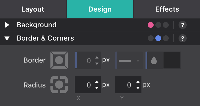
Border settings are controlled by a square toggle with a circle toggle inside. Clicking on the circle selects all borders. To edit a border independently, you would need to select the corresponding toggle. When you select a border, the toggle will be highlighted, indicating that your edits will apply to that border. In this example, we have selected the left border:
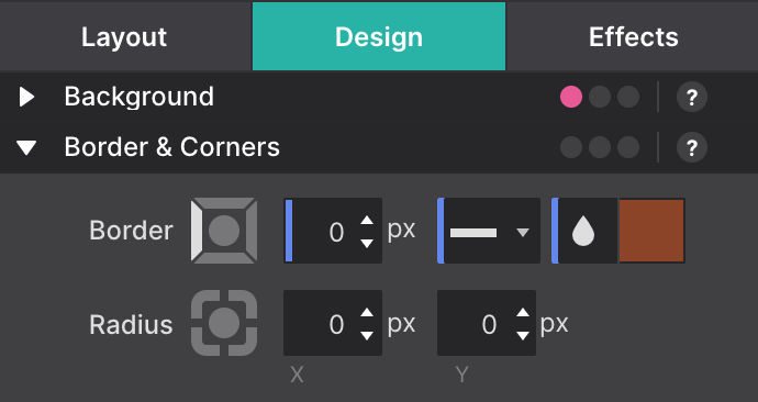
Notice the left border toggle is highlighted, so we are ready to edit the values. If you are adding a border where all the properties are the same, you can select the circle toggle to select all the borders at once.
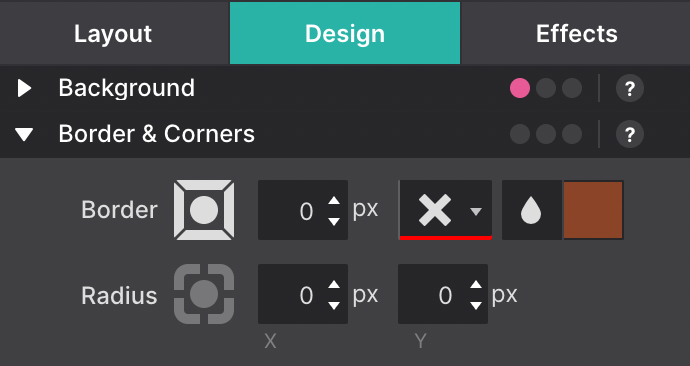
Now that we know how to select and edit a border let's move onto applying some settings.
Border-Width
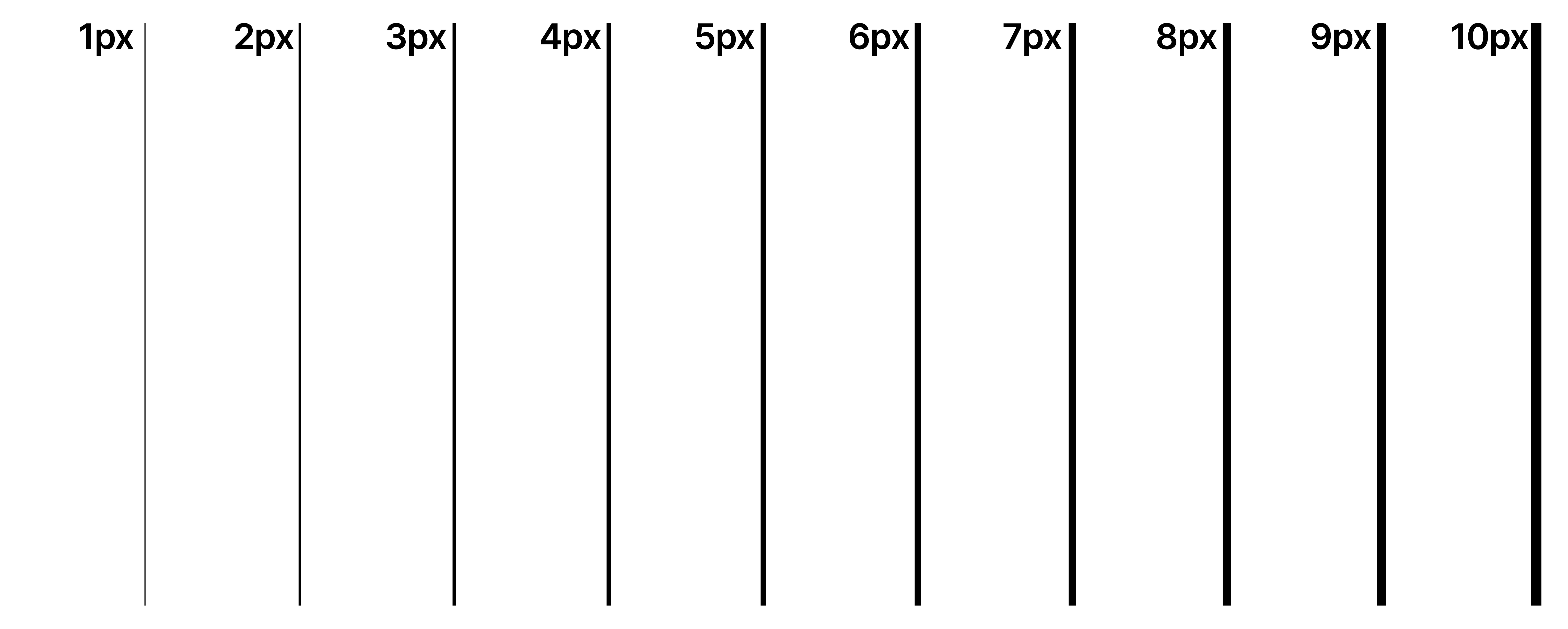
The border width is defined in pixels and represents the thickness the border will take on when applied to the element. This example shows different pixel widths applied to the bottom border of a container:
Border-Style
There are several border styles that you can choose from that you can apply to any object, here is an overview:
None - Specifies no border - This is also how you disable a border once set.

Dotted - Specifies a dotted border

Dashed - Specifies a dashed border

Solid - Specifies a solid border

Double - Specifies a double border

Groove - Specifies a 3D grooved border. The effect depends on the border-color value

Ridge - Specifies a 3D ridge border. The effect depends on the border-color value

Inset - Specifies a 3D inset border. The effect depends on the border-color value

Outset - Specifies a 3D outset border. The effect depends on the border-color value

One other thing you might want to know about border styles is that you can set different properties for each of the borders (top, right, bottom, left). As an example, for “The Coast” logo, you can have multiple borders set for the same element. This is accomplished by applying a double border on the left and right, and a dotted border to the top and bottom.

Border Color
The border color defines which color the border will have. As with the above, you can set a color for each of the individual borders or have them all use the same by using the circle toggle.
The color selection window allows you to select the color using the built-in color slider, or by typing in the Hex, RGB or HSB. Another cool feature of the border color is that you can set an opacity. The opacity can give you a see through effect such as this:

Border-radius
Rounded corners can make a design feel smoother and more appealing. When it comes to rounded corners, you can apply them to any element with the Radius control. For example take the two buttons below, they are the same font, color, size, etc. The only difference between them is the right button has a radius of 5px applied.

As with borders, radius allows you to set different properties for each side of the element using the toggle controls. The toggles include Top-Left, Top-Right, Bottom-Right, Bottom-Left allowing you to set the x (horizontal) and y (vertical) radius of the element.

There are many different designs that you can use that are fairly simple to setup and give you some amazing effects. As an example, add a button to your design and select the Top-Left and Bottom-Right border radius and apply 5px to both the x and y properties.
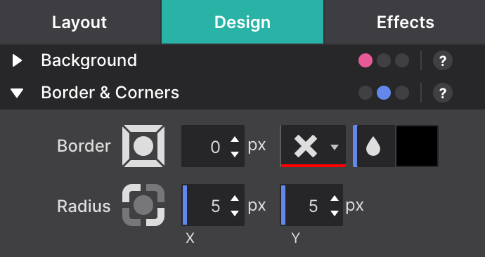
Now set the Top-Right and Bottom-Left to 20px on both x and y.

After you have completed this you should see the following!

Now that you have the rundown on what a border and border radius are, and how to use them, go out and give them a spin. We recommend when you do not understand something, to just try it out and learn how it works. We promise it will not break anything. Code well my friends!
Level up with the Site Designer help guide.
Site Designer gives you the power to work with CSS visually. These code-free controls allows you to experiment with new styles and layouts without having to be a pro at hand coding. Discover the power of Site Designer and start dragging, droppping, clicking, and sliding your way to an epic website.

