Getting to know Responsive Email Designer
There are various functions that assist with the design and message construction. Below you find an overview and summary of what each of these main functions can be used for.
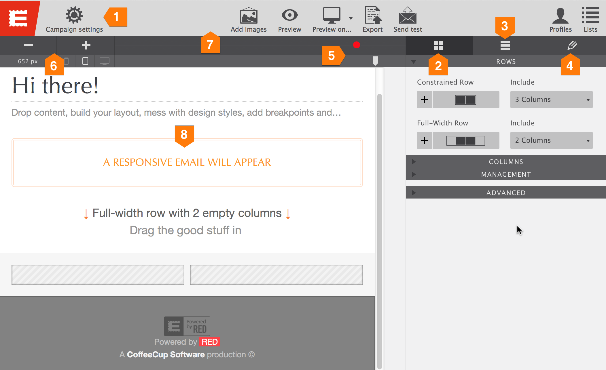
(1) Campaign Settings — The campaign settings dialog consists of four main functions. Here you can connect RED to your CoffeeCup account for updates to the email generator and online image placement. This is also where you connect RED to personal or business email accounts for sending (test) emails and where recipient profiles and test lists are maintained.
(2) Layout Pane — Define the layout of your design for desktop and mobile using a powerful grid system. Add, remove, or reposition rows and columns. Here you can also set the desired width of the email.
(3) Elements Pane — Choose from various Elements such as buttons, images, paragraphs, text links and more. Drop elements in any column or click to insert them below the currently selected element. Yup, it’s that easy.
(4) Design Pane — Here is where the email gains personality. Use intuitive visual controls to change colors, spacing, padding, backgrounds, borders and more.
(5) Sizer & Breaker — With the little triangle (named Sizer), all screen widths that the email may be viewed on can be simulated. Drag Sizer to the left or right, or select him and use the arrow keys. Add dots (breakpoints) to make layout or design changes anytime a troublesome aspect arises on smaller screens size. We named this unique tool Breaker.

The different functions of RED Personal and RED for business.
This tutorial focuses on the functions and screens found in RED Personal. The image above is from RED Personal, with most sections on the right collapsed, the screen for RED for Business would only be slightly different. The functions found in RED for Business are ‘on top of’ the tools and controls found in RED Personal and their functioning will be self explanatory. Where needed the additional functions will be explained in a box like this, with a blue button on the left.
(6) Breakpoint creation — Use the plus button to create a breakpoint where the width slider (Sizer) is positioned. The highlighted breakpoint can be removed with the minus button. Breakpoints can also be added by clicking on Breaker and moved to the left or right by dragging.
(7) The toolbar — The dialog behind the Add images icon allows you to add or remove images from the project. The Preview button launches preview mode in the app, while Preview on... allows you to view the email in a browser. The Export button generates the email code. The resulting code can be copied and pasted into for example the MailChimp dashboard or the Email Notices dialog of Web Form Builder. The code is also saved in an HTML file. The Send test button generates the email code and sends it off through cyberspace. Profiles and Lists give direct access to these functions in the campaign settings dialog.
(8) Editing & live preview — Drop elements, drag them around, add design styles, edit text and watch the email build while you are working. No refreshing or exporting needed to see what the design will look like, and the content flow will feel like in the real newsletter or email.

