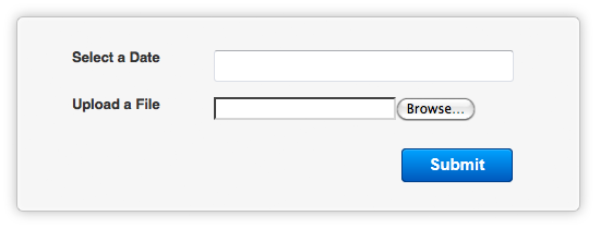
When you publish a form with Web Form Builder, not everyone will see the exact same results. This is just the nature of the web, as no two browsers (or even versions of a browser) render HTML and CSS code identically. We've strived to ensure that forms created with Web Form Builder display as identically as possible in all browsers, but there are certain things, like file upload buttons, that are going to look different. Just take a look at these examples:
Google Chrome 15
Internet Explorer 9
Mozilla Firefox 7
Opera 11
Each one of these browsers displays the "file upload" field in a completely different way! It all has to do with the way the browser has been developed to display content. Web Form Builder creates the code, and then the browser renders that code the way it's been designed to do so. The important thing to note here is that the layout, text, and dimensions of the form remain remarkably similar on each browser.
Also, notice that Opera's "date" field has a down arrow. This is because both Web Form Builder and Opera take full advantage of HTML 5 input types! The other browsers have not implemented support for certain HTML 5 features such as the date picker, number picker, and email fields. But because Opera does, when that down arrow is clicked, a fancy calendar appears:

Since the other browsers don't support a date picker yet (well, Chrome does, but it's a pretty plain-looking calendar), Web Form Builder uses Javascript to pop up a nice-looking calendar to make date-picking easy for the user:

The Javascript is not necessary for Opera, since it has its own date picker.
Well, we hope that clears up any confusion you may have about why your form looks different in certain browsers! This is precisely the reason that we always recommend testing your webpage/form/shop in all major browsers before sharing with the world. That way you know that its quality is up to snuff no matter which browser the visitor is using.


