Web Form Builder and MailChimp
Web Form Builder Facts
- Released in 2005, the first Web Form Software online.
- Easiest form builder in the market today.
- Rebuilt in 2011 to be Web Standards Compliant.
- Over 3.0M downloads powering millions of Web Forms.
MailChimp Facts
- Since 2001, one of the first email newsletter providers.
- Based in ATLANTA - just like us :-)
- Over 16 million customers in 150 countries.
- Delivering over >1 Billion emails every single day.

Web Forms and Email Campaigns
Growing your mailing list can be difficult — unless you use a form that people really want to fill out. With that in mind, we paired Web Form Builder with MailChimp for managed mailing lists that are easy as bananas. Pay one time for the full version (no monthly fees!) and make unlimited forms that you can host anywhere.
We also have free versions of our Web Form Builder software for both Windows and OS X. Just download the app below and get started with a Free MailChimp Account.
Get Web Form Builder Get it for OS X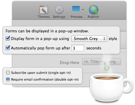
Pop-Up Forms Make Bigger Lists
Our ultra-popular Web Form Builder helps you create beautiful web forms on the fly. With drag n’ drop elements and instantly applied themes, you can design a form in minutes.
The folks at MailChimp provide one of the best email marketing systems on the web. Create newsletters, notices, and more to keep your audience in-the-know via email. Tie our versatile forms to your MailChimp account and you’ve got a combination that can’t be beat.
Web Form Builder’s got some tricks to boost signups, too. Make your form pop up over a webpage automatically to grab the visitor’s attention. When the intuitive form’s right in their face, there’s little doubt that they’ll fill it out.
Sounds awesome! How does this work, exactly?
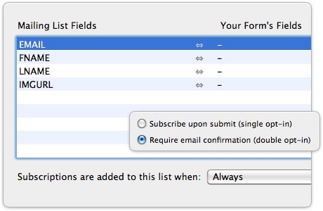
MailChimp provides an API key you’ll use to connect to your mailing lists in Web Form Builder. Just plug it in and you’re ready to go. You can work with more than one mailing list at a time, and even manage several with one form. Simply match elements from your form to fields in your MailChimp mailing lists and you can call up email addresses, names, phone numbers, and anything else you collected on your sign-up form.
Web Form Builder quadruple-checks everything you configure to make sure nothing goes wrong. Whether it’s a required field or a set of radio buttons, your form will let you know when something doesn’t quite match up with your what your MailChimp emailing campaign needs.
Safeguarded Sign-Ups
You decide whether you want single or double opt-in from your form. Double opt-in sends an email to the subscriber and waits to hear back from them before adding them to the list. This ensures that the email addresses you’re gathering actually belong to the people who signed up.
It’s courteous to give your readers the option to unsubscribe, and you can furnish your form with this option to keep everybody happy.
How cool are these Web Forms?
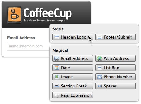
With 19 elements and counting, including file upload and date fields, you can create exactly the form you need. Configure field widths or use multiple columns, swap out designs with a single click in the Theme Browser, include images, and make any other big or small tweaks that you need.
But that’s not all. Customize the header and footer of the form, add a big, beautiful logo at the top, adjust the submit button how you see fit, and even style the Captcha box. With this much freedom, you can match an embedded form to any website design or mailing campaign.
Why MailChimp?
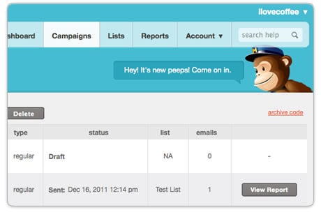
We like these peeps and their email solution! Creating HTML newsletters on your own is a pain, but using their bulletproof templates and sweet designs is about as easy as it gets. You can split your email to different groups with A/B testing to see which approach works better. Their inbox inspector shows what your mail will look like in various email clients, so you know exactly how your message will be received. You can even share your emails on social networks.
We believe in their service and their approach. With tons of tools and a great support team (a philosophy we share), we feel that their service is top notch.