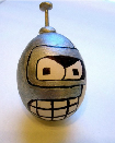
James Hunt: Actually, Murray, they're not flames, it's the safety light.
Many thanks for your comments, they are really appreciated....
Murray Walker: And look at the flames coming from the back of Berger's McLaren
James Hunt: Actually, Murray, they're not flames, it's the safety light.
James Hunt: Actually, Murray, they're not flames, it's the safety light.
This is the latest site I have made. Always use VSD. Have appreciated all the wonderful help I have received from this forum for all my sites. Am starting a new site for a family that has a mulch farm. This one is a medical supply company. The owner likes the site, but says it's boring. Eek! Any suggestions?
http://www.arcdistributors.com
http://www.arcdistributors.com
All these websites look really great. Maureen, you put a lot of work into adding content- lots of good content,..well done.
Web Design: https://www.websnoogie.com
Member - BBB: Websnoogie, LLC
Member - BBB: Websnoogie, LLC
Sarah - the site might be a little bland, but within seconds of checking it out I found something my mother-in-law needs that we didn't know existed. It was very easy to get the product description and find a provider/location close to us. There's one problem solved in less than a minute! So I'd say the site is quite functional! Thanks for sharing it 
I love deadlines. I like the whooshing sound they make as they fly by. (Douglas Adams)
https://www.callendales.com
https://www.callendales.com
Hi friends,
After 8 months of inactivity, I finally updated my sixties music website. I added Crosby, Stills and Nash and The Band (how could I ever forget them, thanks Cees-Jan -yes, I'm Dutch:)-, for reminding me). The site is a mix of VSD, some HTML (like the News section) and a MYSQL database for the music. I use the Wimpy player (SQL version) for the database. When you register, you can make your own playlists! And thanks all of you who registered in the past period. And anybody who finds more omissions, let me know!
http://sixties.johnvanhulst.com
Have fun!
John van Hulst
Paintbrush, Thanks for your feedback. I am so glad the site helped you, Am thinking of how to make the site more interesting so that the owner will be more delighted with it. Maybe a video or a photo gallery. Always appreciate your comments. Thanks.
Sarah,
I was thinking if you changed the banner on the home page to be a little more exciting, it might help. The dark, heavy black box around plain text might be the "boring" part. Just a suggestion.
I was thinking if you changed the banner on the home page to be a little more exciting, it might help. The dark, heavy black box around plain text might be the "boring" part. Just a suggestion.
Steven, thank you for the idea. I am desparately looking for something to give it some bounce. You're right. I used that because that is what she had on her old site and she likes the black and maroon. But, yes I can make it look better, less like a "death notification". Thanks.
Have something to add? We’d love to hear it!
You must have an account to participate. Please Sign In Here, then join the conversation.


